| color
My theory. Theory #1, that is mine.

| |
When I was about nine, I developed a theory. What if everybody actually sees very different colors but calls them by the same names. Like, I look at a tree and see its leaves as a color I call 'green'. When you look at the tree, you see a color that I would call 'red' but you call that color 'green'. The only way to prove the difference would be if I could climb into your body and see through your eyes and say 'hold on, you've got the colors all backwards."
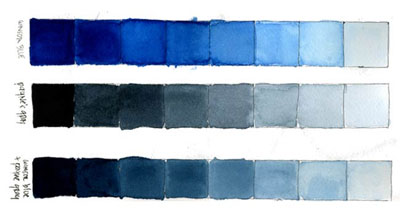
It wasn't a terribly useful theory. Still, I've thought about it again quite often since starting my color class. What I've become increasingly aware of is how inaccurate my observations of color really are. I'm not colorblind and I have 20/20 vision but I rarely see what's really in front of me. The root cause seems to be the same thing that blocked me from drawing all those years: converting reality into symbols. I've discussed before my discovery that when we reduce our observations to symbolic shorthand (that's a car, that's a building, that's a person) we are forced to draw only symbols instead of accurate representations of the very specific reality that lies before us. If we are fairly well-versed in creating drawn symbols we can communicate the general ideas we perceive but can never capture the specific essence of what is there, in other words, draw accurately.
| |
[more]
thanks to rachael's latest
Cataloging Colors

| |
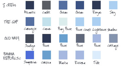
What does it take to name a color? Manufacturers do it every day for their own convenience. It helps them keep track of what they're making and how it's selling and distinguishes one season from another. Apparently, it also makes colors more desirable, forming associations between random hues and exotic places and objects and values and flavors and anything else that might help sell.
Still, there's something presumptuous about assigning a title to a particular color, like naming a star or a species or a mountain. Who gave Old Navy that right? And what a sloppy job they do too, giving very different colors the same name or vice versa. Crayola and Pantone are a lot better at it.
All this cavalier designation helps to compromise what we see. The names are meaningless because the relationship between the names and the colors are so inconsistent. These blues aren't the same when they are printed in our catalogs, or on our computers screens, or dyed into yarn, or worn in sunlight, or washed ten times.
What matters in the end is not these ill-fitted names but the fact that we recognize and appreciate the many hues we see all around us, that we don't become desensitized through commerce's clumsiness and yen to market everything under the sun, and start to mistrust the incredible abilities of our eyes and brains. When we try to shoehorn colors into chip and swatches, we diminish our environment and blind ourselves, just a little bit more, to the infinite subtlety and wonder of the universe.
| |
[more] |

